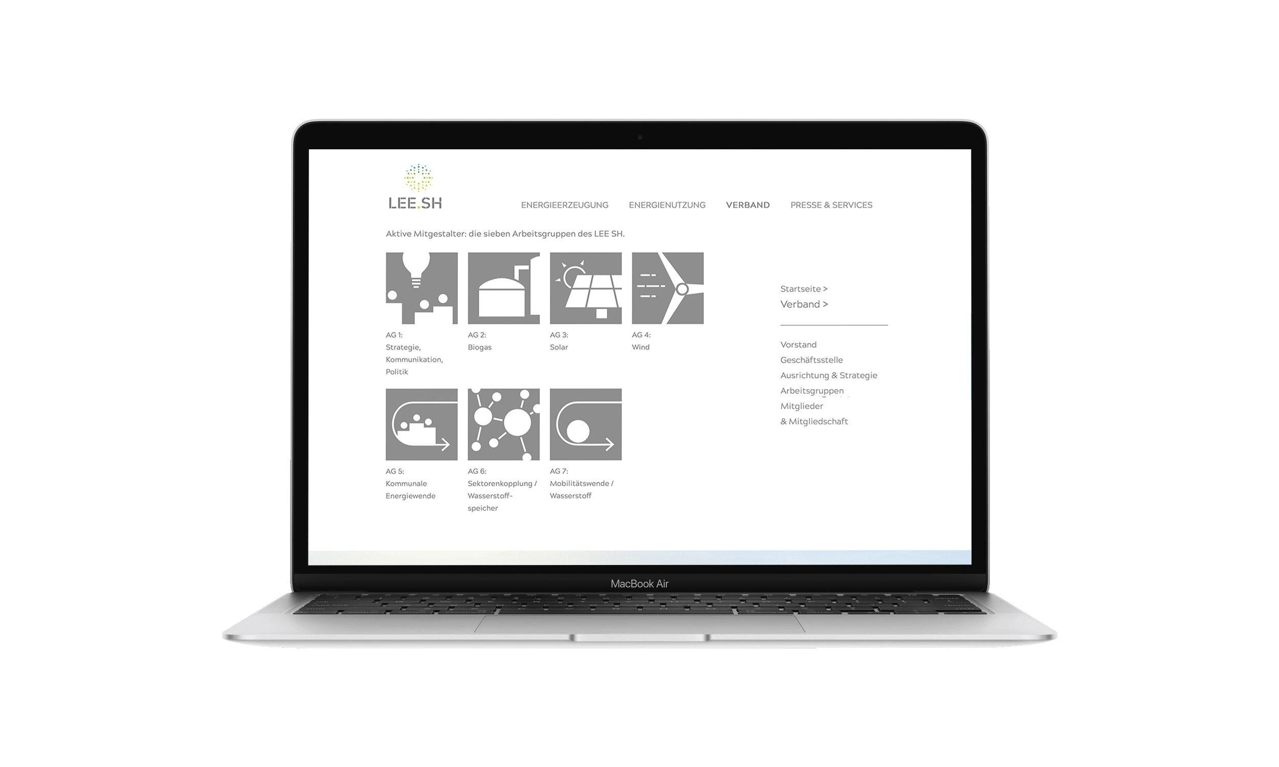
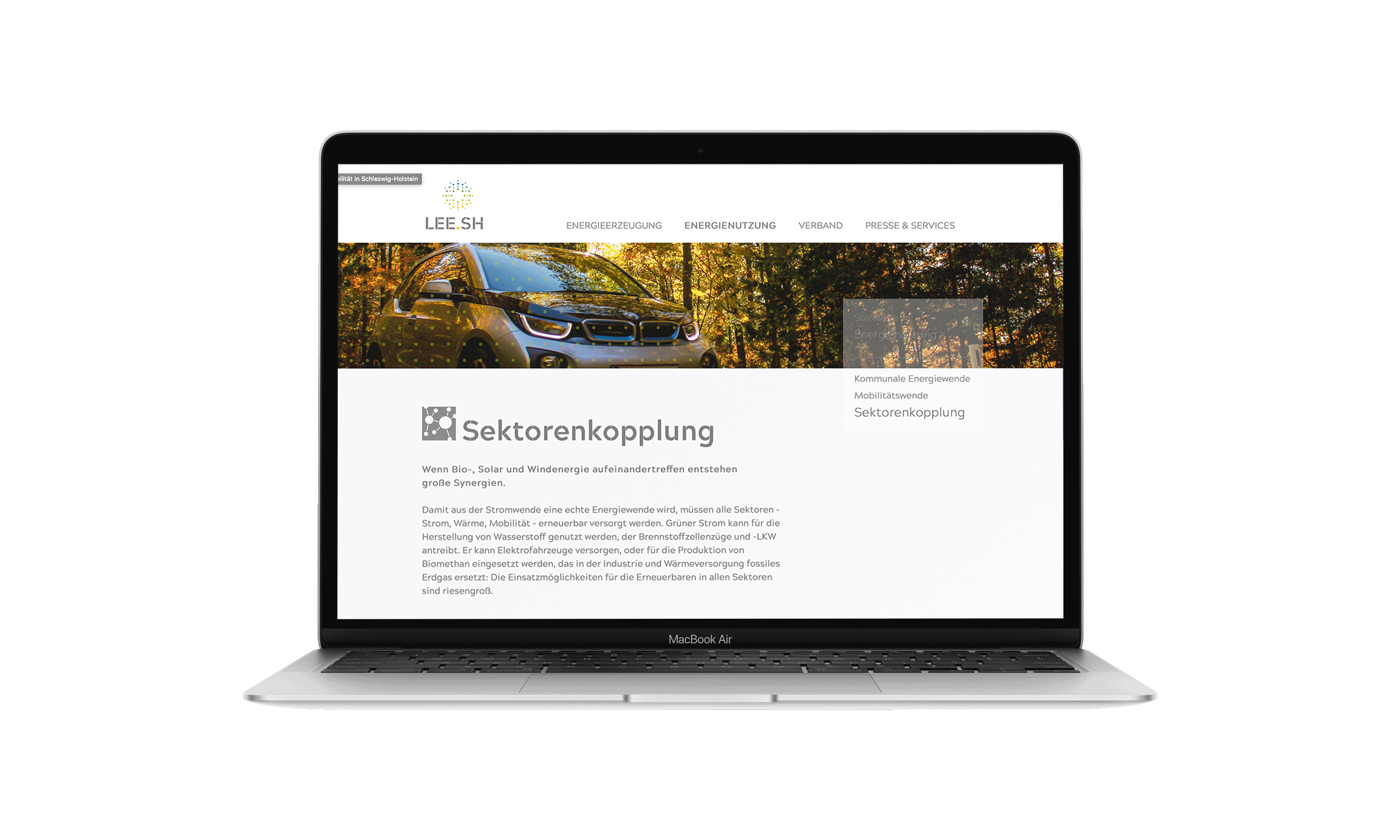
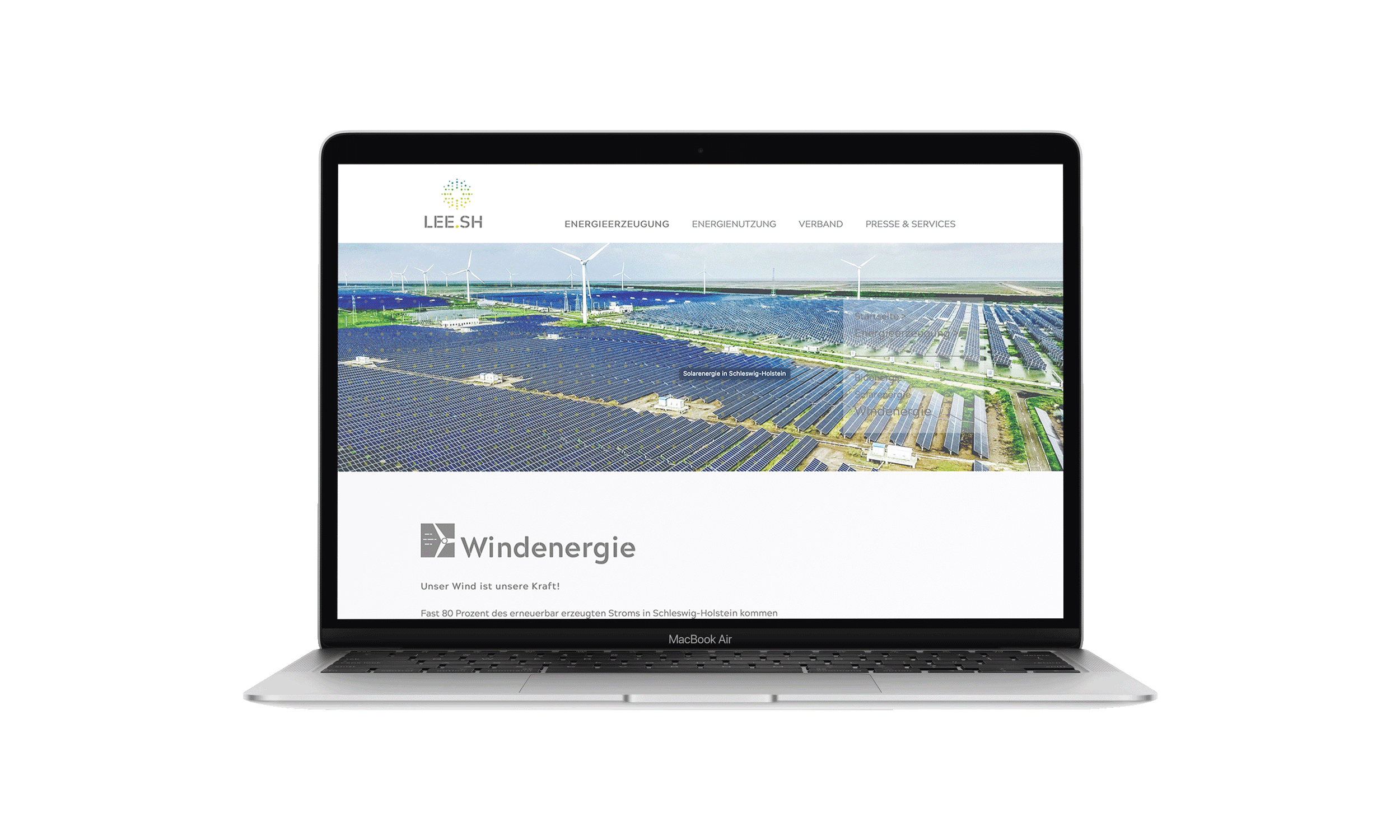
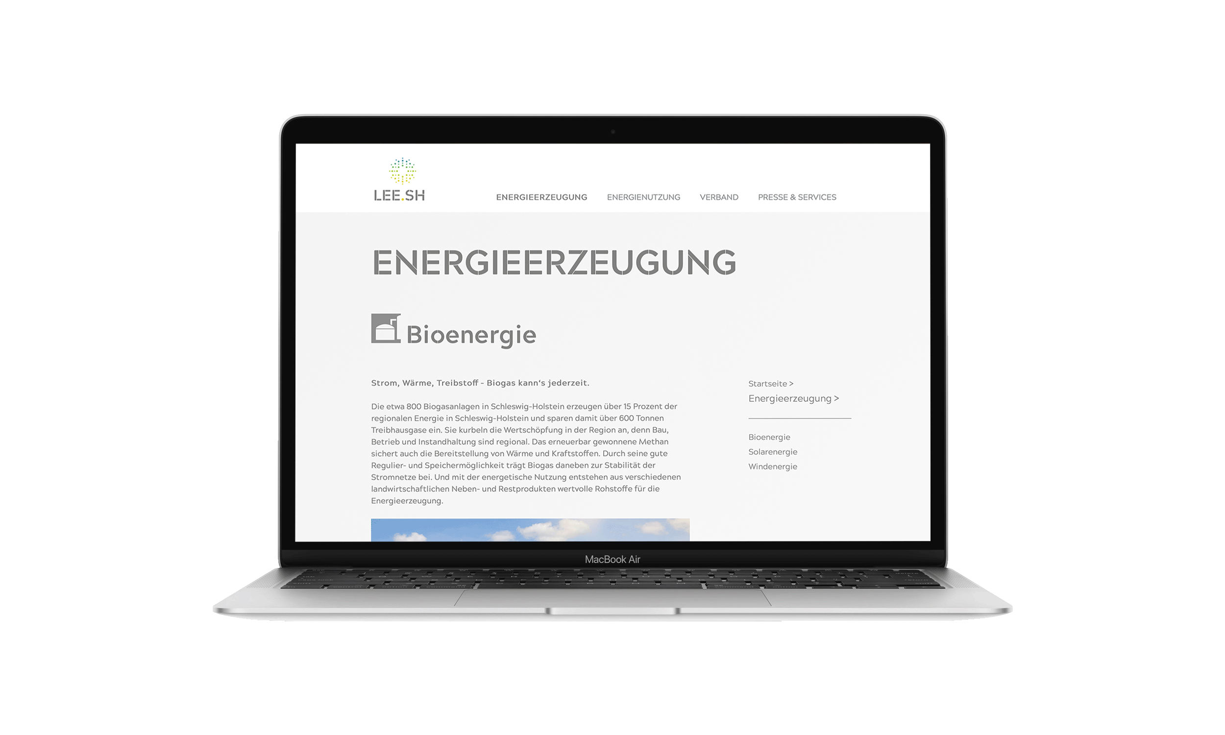
LEE.SH is the State Association for Renewable Energies in Schleswig-Holstein and it is commited to the diversity and common strength of the renewable energy industry and to a 100% renewable energy supply. To emphasize their fields in energy production and energy use I designed Icons for each of their working group. The Icons symbolize what is meant by the title of the respective area. Moreover the visualizatoin makes it more descriptive and appealing to the viewers. The use of colour and form reflects the companies appearance. Uncluttered, grey, rectangular shaped forms go with the clean, focused and modern image and tonality.
Lee.SH Icons
2020
Logo Design, Corporate Identity